
Mobile menu
Choose the mobile header layout, set an optional mobile-only logo, and order the icons shown on small screens.
Customize > Header > Mobile Menu
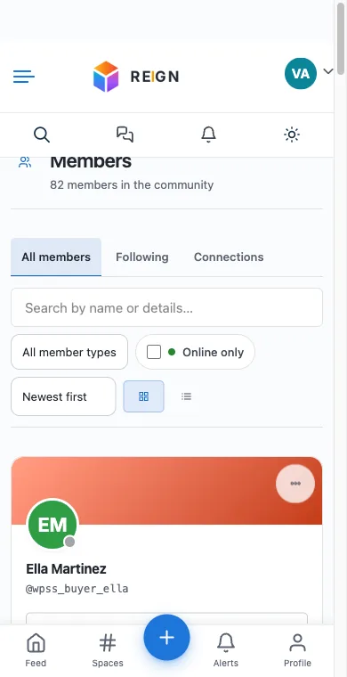
This section is where you control the header on phones and tablets, separately from the desktop header covered under Header Layout.
Mobile header layout
Mobile Header Layout offers three options:
- Layout One places the header icons in a second row below the logo.
- Layout Two, the default, renders the icons inline with the logo in one row, which costs less vertical space above the fold. This has been the default since 8.0.4.
- Layout Three, a third arrangement.
Since vertical space is scarce on a phone screen, Layout Two is usually the better choice unless your icon set is too wide to fit comfortably alongside the logo at your chosen logo size.
Mobile menu width on tablets
Mobile Menu Width sets how wide the slide-out menu panel is on tablets, as a percentage of the screen, from 40% to 100%. It applies from 640px screen width up. Phones always get a full-width panel. The default is 100%, so nothing changes until you lower it.
Lower it when a short menu stretched edge to edge on a tablet looks empty. 70% to 80% suits most menus.
The panel works as a proper dialog for keyboard and screen-reader users: focus moves into it when it opens, stays inside it, Escape closes it, and focus returns to the menu button.
A separate mobile logo
By default, mobile uses the same logo as desktop, scaled down. Use a Custom Mobile Logo, off by default, lets you upload a different image for mobile instead, useful if your desktop logo is a wide horizontal lockup that does not read well at small sizes. Once enabled, Mobile Logo is where you upload it.
Logo Size sets the maximum height of whichever logo is showing on mobile and tablet, independent of the desktop logo size.
Mobile header icons
Mobile Header Icons Options is its own sortable list, separate from the desktop header’s icon order. Reordering the desktop icons under Header Layout does not touch this list, and vice versa, so set both if you want a consistent order across devices.
The available icons follow the same rules as desktop: Search and User Menu / Login / Register are always available, Cart appears with WooCommerce or Easy Digital Downloads active, and Message / Notification / Friends Request appear with a community plugin active (Friends Request only with BuddyPress specifically, not BuddyNext). The Light / Dark Toggle can be dragged into this list as well.
When to change these
Check the mobile header on an actual phone width after any change here, not just by narrowing a desktop browser window. Layout choice and icon count interact: a longer icon list needs Layout One’s second row more than a short one does.