
Header layout
Pick a header style, order its icons, and set how the main menu behaves on hover from Header > Layout.
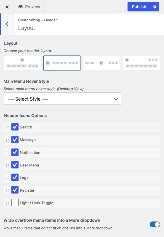
Customize > Header > Layout
This is the starting point for the header: which of the four built-in layouts you use, what icons appear in it and in what order, and how the main menu reacts to hover.
Header style
Layout picks one of four header layouts (v1 through v4) using a visual picker. This is a structural choice, it changes where the logo, menu and icons sit relative to each other, so try each one against your actual menu and logo before settling on one.
If WooCommerce is active and you pick Layout v4, an extra Header Search Style control appears, letting that layout’s search box search products specifically (Product Search) or fall back to the standard WordPress search (Default Search).
With BuddyNext and WooCommerce both active, this same control also decides whether the header search icon opens BuddyNext’s community search, on every layout. Product Search keeps product search; Default Search switches to the community search. See the header search in the BuddyNext guide for the steps.
Header icons
Header Icons Options is a sortable list: drag icons into the order you want them to appear in the header. Which icons are available depends on what is active on the site:
- Search and User Menu / Login / Register are always available.
- Cart appears once WooCommerce or Easy Digital Downloads is active.
- Message, Notification, and Friends Request appear once a community plugin (BuddyPress or BuddyNext) is active. Friends Request is specific to BuddyPress; BuddyNext does not have an equivalent, so it is not offered there.
- Light / Dark Toggle can be dragged into this same list to place the light/dark mode switch among the other icons rather than pinned after them.
Reordering here only changes desktop. Mobile has its own icon order under Mobile Menu.
Menu hover behaviour
Main Menu Hover Style applies to the desktop menu only, and offers six built-in hover styles (Hover Style 1 through 6) for how a top-level menu item responds when a visitor points at it. Left at ”--- Select Style ---”, no special hover treatment is applied beyond the theme’s base styling.
Wrap overflow menu items into a More dropdown, on by default, moves menu items that do not fit on one line into a “More” dropdown instead of letting them wrap or overflow. Turn this off only if you have a short menu and would rather see items disappear or wrap than ever show a More dropdown, most sites should leave it on.
When to change these
Choose the header style first, since it constrains what else makes sense visually, then set the icon order to match your priorities (a store leads with cart and search, a community site leads with message and notification), then pick a hover style that matches the rest of your site’s motion and tone.