
Left panel
Configure the optional slide-in navigation panel, covering behavior, size and spacing, icon styling and menu text, from Header > Left Panel.
Customize > Header > Left Panel
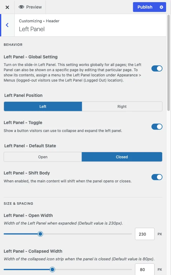
The Left Panel is an optional slide-in navigation drawer, an alternative or supplement to the main header menu. Its 32 controls are grouped into four areas: Behavior, Size and Spacing, Icon, and Menu Text. Its colors are not among them, they come from your color scheme instead, covered below.
Behavior
Left Panel - Global Setting is the master switch, on by default. It works site-wide. Two related facts worth knowing:
- The panel can also be turned on for one specific page by editing that page directly, independent of this global setting.
- Its contents come from a menu you assign under Appearance > Menus, to the Left Panel location for logged-in visitors and the separate Left Panel (Logged Out) location for everyone else. Turning the switch on does nothing visible until a menu is assigned to one of those locations.
The remaining behavior controls:
- Left Panel Position puts the panel on the left or the right of the screen.
- Left Panel - Toggle shows a button visitors use to collapse and expand the panel. On by default.
- Left Panel - Default State sets whether the panel starts open or closed on page load. Default is closed.
- Left Panel - Shift Body pushes the main content sideways when the panel opens, rather than letting the panel overlay the content. Off by default, and not compatible with the Boxed site layout, so leave it off if you use a boxed layout.
- Left Panel - Start Below Header makes the header, top bar and footer span the full width, with the panel starting under the header and ending where the footer begins. Off by default, desktop only. It needs Sticky On Scroll switched on under Customize > Header > Sticky Menu (see sticky menu) and does nothing without it. Not compatible with the Boxed site layout.
The toggle button announces its name and open or closed state to screen readers, and when the panel is collapsed its menu labels show on keyboard focus.
Size and spacing
Four sliders drive the panel’s dimensions:
- Left Panel - Open Width, default 230px, the panel’s width when expanded.
- Left Panel - Collapsed Width, default 80px, the width of the icon-only strip when the panel is closed.
- Left Panel - Header Height, default 80px, the height of the panel’s own header area that holds the toggle button.
- Left Panel - Menu Item Spacing, default 8px, the vertical gap between menu items.
Icon
Three controls style the icons shown next to each menu item:
- Left Panel - Icon Font Size, default 18px.
- Left Panel - Icon Height/Width, default 47px, the size of the icon’s clickable box.
- Left Panel - Icon Border Radius, default 6px.
Menu text
- Left Panel - Menu Text Typography sets the font family, size, weight, spacing and transform of the menu label text. The icon next to it is sized separately, using the Icon Font Size control above.
- Left Panel - Section Header Font Size, default 12px, sizes the small section-header labels that can appear within the panel’s menu structure.
Colors come from your palette
This section deliberately has no color controls. The panel’s background, toggle, menu text, hover and active colors are all set per color scheme under Customize > Color Options instead. If you need the panel to use a different color than the rest of the site, that is an Individual Colors override, not something you will find here.
When to use the Left Panel
It suits sites with more navigation than a horizontal menu bar can hold comfortably, member directories, multi-section communities, dashboards, or any site where you want persistent navigation available from every page without competing for space in the header.