
Member and group directories
The real choices behind the members, groups and activity directories, and the single member and group screens, on BuddyPress and BuddyBoss.
These settings need BuddyPress or BuddyBoss Platform active (see set up BuddyPress or set up BuddyBoss Platform). They split across two places, and knowing which is which saves you hunting: the Customizer controls sidebars and navigation, while the actual grid layout and card content live in Reign Settings.
Running BuddyNext? These particular controls do not appear - they are specific to BuddyPress and BuddyBoss. Reign styles BuddyNext’s own screens instead; see set up BuddyNext.
Sidebar layout: Customizer
Appearance > Customize > Community Settings has one section per directory: Activity Directory, Members Directory, Groups Directory. Each offers the same four-image choice: left sidebar, right sidebar, both sidebars, or full width. This is the only thing these three sections control. These sections need BuddyPress 12 or newer, or the BP Classic compatibility plugin, on older BuddyPress versions.
The practical choice: full width if you rely on the directory looking like a clean grid or app-style feed, one or two sidebars if you use them for filters, promotions, or a widget-based “who’s online” list.
Grid layout and card content: Reign Settings
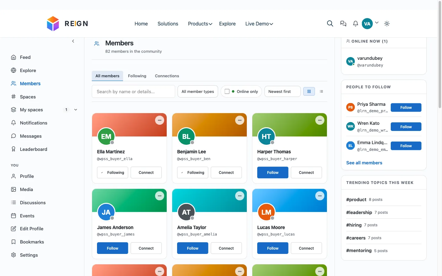
The actual look of the directory grid, not its sidebars, is set at Reign Settings > Community > Community Settings > Member/Group Cover Header Layout:
- Member’s Directory Layout and Group’s Directory Layout - four image-preview layouts each, picked by clicking the one you want. This is where you choose how densely members and groups are packed and how much of each card (avatar, cover, name) is visible, not in the Customizer.
Two more choices that shape what a card and a page show live in the same admin screen’s other tabs:
- Avatar Settings - the fallback avatar image for members and groups, used until someone uploads their own. Hidden here on BuddyBoss, which manages its own avatars.
- Advanced Settings > Members per page / Groups per page - how many results load per directory page, 21 by default for each. Raise this if your directories feel too paginated, but test load time on a large member base before doubling it.
- Advanced Settings also has toggles for whether a member’s or group’s cover-image and image changes post to the activity stream, which affects how busy that stream looks on an active site.
Single member and single group screens
Two more decisions apply once someone opens an individual profile or group rather than a directory:
Header layout, in the same Reign Settings screen: Member Cover Header Layout and Group Cover Header Layout each offer four layouts, plus a Profile Cover Header Position choice of Inside or Top, which moves the name and action buttons onto or below the cover image.
Navigation style, back in the Customizer’s Community Settings panel:
- Member Profile and Single Group sections each have a Navigation Style choice of Default or Icon + Label, for the tabs across the top of that screen (Activity, Groups, Friends, and so on for a profile; Home, Members, Activity for a group).
- The Navigation section sets how that navigation behaves as a bar: Swipe, Text + Icons (Swipe), or More for the main tab row, and a matching choice, plus a Default option, for its submenus. Swipe and More only change behaviour on small screens.
The four BuddyPress-only controls
All four live under Customize > Community Settings. They appear only while BuddyPress (or BuddyBoss) is active, so you will not see them on a site without a community plugin, or on a BuddyNext site. If one is missing, check that the plugin is active first.
| Control | Where | Choices | Default |
|---|---|---|---|
| Activity Directory Sidebar | Activity Directory | Left sidebar, right sidebar, both sidebars, full width (shown as pictures) | Right sidebar |
| Single Group Navigation Style | Single Group | Default, Icon + Label | Icon + Label |
| Navigation View Style | Navigation | Swipe, Text + Icons (Swipe), More | Text + Icons (Swipe) |
| Submenu Navigation View Style | Navigation | Default, Swipe, More | Default |
Activity Directory Sidebar only shows on BuddyPress 12 or newer, or when the BP Classic plugin is active. It controls the sidebars on the activity page, the same way the Members and Groups directory sidebars work.
Single Group Navigation Style sets how the tabs at the top of a single group look. Icon + Label shows an icon with each tab name.
Navigation View Style applies to the main row of tabs on a single member and a single group. Submenu Navigation View Style applies to the smaller row of submenu tabs under it, for both. Swipe and More change the layout on small screens only.
Making the choice
For most sites: pick a directory grid layout that matches how many members or groups you expect to list, leave the sidebar on right or full width, and use Icon + Label navigation on single screens so the tabs stay identifiable on a phone without a sidebar to give them context. Come back and loosen the per-page count only once you have real content to judge it against.