

Most WordPress accessibility guides are written for brochure sites: a homepage, a contact form, a blog. A community site running Reign and BuddyPress is a different animal. The homepage is the easy part.
The hard part is everything that happens after someone logs in. An activity feed inserts new posts above the fold while someone is mid-scroll. A member directory is built almost entirely out of avatar thumbnails. Registration and profile forms stack three and four deep. A “load more” button silently swaps in forty more members without ever reloading the page.
A generic alt-text checklist was written for pages that sit still. A community site doesn’t sit still, and neither does the checklist it needs.
Dynamic regions, avatar-only identification, nested forms, and infinite scroll each have their own failure modes under the Web Content Accessibility Guidelines, the same forms and feeds that show up in a lot of our community moderation and registration flows. WCAG 2.2, the current version published by the W3C in October 2023, added several success criteria that land directly on these patterns: target size for the small icon buttons community themes are full of, dragging movements for drag-to-reorder admin screens, and accessible authentication for the login and registration flow every member passes through.
This is a site-owner’s checklist, not a theme-author’s spec. If you’re building blocks or a child theme and need criteria for the code you ship, that’s a different document with a different audience. This one is for the person running a live Reign community: how to check the site you actually have, with tools you can install today, against the version of WCAG that’s current right now.
WCAG 2.2: What’s New, at a Glance
Nine success criteria are new in WCAG 2.2 over 2.1. Six sit at Level A or AA, the practical compliance bar most organizations target. The table below lists those six, since they’re the ones most likely to surface on a live community site.
| Criterion | Level | Community site example |
|---|---|---|
| 2.4.11 Focus Not Obscured (Minimum) | AA | Sticky activity-feed header hiding the focused item while tabbing |
| 2.5.7 Dragging Movements | AA | Drag-to-reorder profile fields with no button-based alternative |
| 2.5.8 Target Size (Minimum) | AA | Icon-only reaction buttons smaller than 24×24 CSS pixels |
| 3.2.6 Consistent Help | A | Support link present on step 1 of registration, missing on step 3 |
| 3.3.7 Redundant Entry | A | Multi-step group creation that re-asks for an email already entered |
| 3.3.8 Accessible Authentication (Minimum) | AA | Login CAPTCHA with no non-visual alternative, or password field blocking paste |
Table of Contents
- Why Community Sites Are a Different Accessibility Problem
- Perceivable: Can Members Perceive Your Content?
- Operable: Can Members Operate Every Control?
- Understandable: Do Members Know What’s Happening?
- Robust: Does It Work With Assistive Technology?
- Deep Dive: Activity Feeds and Live Regions
- Deep Dive: Member Directories and Avatar Identification
- Deep Dive: Forms Everywhere
- Deep Dive: Infinite Scroll and Load More
- Tools to Test With
- A Real-World Scenario
- FAQs
- Conclusion
Why Community Sites Are a Different Accessibility Problem
A brochure site is mostly static. You write the content once, an accessibility checker scans it once, and the result holds until the next edit.
A BuddyPress community built on Reign is closer to a web app. The activity stream re-renders as people post. The member directory loads new rows on scroll. Notification counters update without a page refresh. Group creation is a multi-step wizard. None of that is wrong to build, it’s what makes a community feel alive, but every one of those patterns has a WCAG criterion that specifically governs it, and most of those criteria don’t come up at all on a static page.
Four things make community sites structurally harder to get right:
- Content updates without a page load. New activity items, “X liked your post” notifications, and “saving…” states on profile edits are all content changes that a sighted mouse user notices instantly and a screen reader user may never hear unless the markup says so.
- Identity is visual by default. A member directory is a wall of circular avatar images. If the only way to tell two members apart is the picture, you’ve built an interface that depends entirely on vision.
- Forms are the primary interaction, not an afterthought. Registration, profile editing, group creation, event RSVP, forum posting, a community site has more forms per visit than almost any other site type, and WCAG has nine separate success criteria just for forms.
- Pagination got replaced with infinite scroll. Traditional pagination is trivially accessible: it’s a list of links. Infinite scroll and “load more” buttons remove that structure and introduce new risks around focus management and keyboard operability.
The checklist below is organized the way WCAG itself is organized, by the four POUR principles, with the community-specific failure mode called out under each criterion, not the generic one you’ve already read a dozen times.
Perceivable: Can Members Perceive Your Content?
Perceivable means information and UI components have to be presentable to users in ways they can perceive, which on a community site means more than “add alt text.”
- 1.1.1 Non-text Content (A). Every avatar, cover photo, group icon, and badge needs real alt text. The failure mode on BuddyPress installs: avatars get alt=”” or alt=”avatar” by default, which tells a screen reader user nothing about whose avatar it is. Test: tab or arrow through the member directory with a screen reader running and listen for whether each entry announces a name, not just “image.”
- 1.3.1 Info and Relationships (A). Activity items, directory cards, and notification rows need to be marked up as what they are, a
<ul>of items, not a stack of unrelated<div>s with CSS doing the visual grouping. Run the page through the accessibility tree (axe DevTools or your browser’s built-in inspector) and confirm each activity entry is exposed as a list item, not an anonymous block. - 1.4.1 Use of Color (A). Status badges (online/offline, pending/approved, read/unread) can’t rely on color alone. A green dot and a gray dot that are the only difference between “online” and “offline” fail this criterion outright for anyone who can’t distinguish the hue.
- 1.4.3 Contrast (Minimum) (AA). Normal text needs a 4.5:1 contrast ratio against its background; large text (18pt, or 14pt bold, and above) needs 3:1. The place this breaks on community themes: muted timestamp text (“2 hours ago”), placeholder text in search and comment fields, and label text layered over a cover photo.
- 1.4.11 Non-text Contrast (AA). This is the one most sites miss entirely: UI components and graphical objects, button borders, form field outlines, the notification dot itself, icon-only buttons, need a 3:1 contrast ratio against adjacent colors. Status badges and notification dots are exactly the kind of small graphical object this criterion targets, and they’re everywhere on a community dashboard.
- 1.4.4 Resize Text (AA) and 1.4.10 Reflow (AA). Zoom the page to 200% (or resize the viewport down to 320px wide, which is the reflow test) and confirm the activity feed, directory grid, and group header don’t clip content, overlap avatars, or force horizontal scrolling. Card-grid layouts with fixed-width avatar columns are the most common Reign-side failure here.
- 1.4.12 Text Spacing (AA). Apply the WCAG text-spacing bookmarklet or browser override (line height to 1.5x, paragraph spacing to 2x font size, letter spacing to 0.12x, word spacing to 0.16x) and check that activity text and comment threads don’t truncate or overlap.
- 1.4.13 Content on Hover or Focus (AA). Member tooltips, “who liked this” popovers, and hover cards that preview a profile need to be dismissible (Esc), stay visible while the pointer moves onto them, and not disappear the instant focus shifts.
Operable: Can Members Operate Every Control?
Operable covers keyboard access, timing, and physical interaction, the category where infinite scroll, drag interactions, and small icon buttons live.
- 2.1.1 Keyboard (A) and 2.1.2 No Keyboard Trap (A). Every action a mouse user can take, liking a post, opening a group’s member list, dismissing a notification, reacting with an emoji, has to be reachable and operable from the keyboard, and none of them can trap focus so Tab can’t get back out. Modal dialogs (group creation, photo lightboxes, the “who reacted” list) are the most common trap: test by opening each one and pressing Tab repeatedly to confirm focus cycles inside it and Esc closes it cleanly.
- 2.2.1 Timing Adjustable (A) and 2.2.2 Pause, Stop, Hide (A). If the activity feed auto-refreshes or polls for new items, there has to be a way to pause or stop that update, because a stream that keeps re-rendering above the user’s current reading position is disorienting for a screen magnifier or low-vision user even when it’s not technically a WCAG violation for a static page.
- 2.4.3 Focus Order (A) and 2.4.7 Focus Visible (AA). Tab order through an activity item (avatar, name, content, like button, comment button) needs to match the visual order, and every focused element needs a visible focus indicator. Reign’s default focus ring can get silently overridden by card-hover CSS, test by tabbing through a directory grid and watching for any control that loses its outline on focus.
- 2.4.11 Focus Not Obscured (Minimum) (AA), new in WCAG 2.2. When a focused element sits under a sticky header or a “new posts” banner, it can’t be completely hidden by that fixed element. Community sites with sticky nav bars and sticky “jump to top” banners on the activity feed are a direct hit for this one: tab down through a feed and check whether the sticky bar ever fully covers the focused item.
- 2.5.3 Label in Name (A). An icon-only “like” or “follow” button needs its accessible name to contain the visible label if there is one. If a button shows a heart icon with no visible text but has
aria-label="Like this post", that’s fine; if it shows visible text and a mismatched aria-label, voice-control users who say what they see can’t activate it. - 2.5.7 Dragging Movements (AA), new in WCAG 2.2. Any drag-based interaction (reordering profile fields in admin, drag-to-upload photo galleries, drag-and-drop in a group’s file manager) needs a non-drag alternative, like up/down buttons or a “move to position” input.
- 2.5.8 Target Size (Minimum) (AA), new in WCAG 2.2. Pointer targets need to be at least 24×24 CSS pixels, unless they’re inline in text, have an equivalent larger alternative, or sufficient spacing keeps a 24px circle around them from touching the next target. Icon-only reaction buttons, notification bell dropdown items, and the small “x” dismiss icon on notification toasts are the classic community-site misses, measure them in your browser’s dev tools, don’t eyeball it.
Understandable: Do Members Know What’s Happening?
Understandable is where registration, profile editing, and group creation live, and where WCAG 2.2 added the most new criteria of any principle.
- 3.1.1 Language of Page (A).
<html lang="en">(or the site’s actual language) needs to be set, so a screen reader loads the right pronunciation rules. Check this once site-wide; it rarely breaks per-page but is worth confirming after a multilingual plugin install. - 2.4.6 Headings and Labels (AA). Every form field needs a programmatically associated label, not just placeholder text that disappears on focus. Registration and profile-edit forms built with page builders are the most common offender: a visually-styled “label” that’s actually a
<div>or a placeholder attribute with no<label for>behind it. - 3.3.1 Error Identification (A) and 3.3.3 Error Suggestion (AA). When registration or group creation rejects a field, the error needs to be identified in text (not color alone) and, where possible, suggest the fix, “Username already taken, try jane_doe2” rather than a bare red border. Test by deliberately submitting a bad value in every multi-step form and confirming the error is announced, not just visually shown.
- 3.3.2 Labels or Instructions (A). Password requirements, username format rules, and file-size limits for avatar uploads need to be stated before the user submits, not discovered only after a failed attempt.
- 3.2.6 Consistent Help (A), new in WCAG 2.2. If there’s a help link, support contact, or chat widget available on one step of registration, it has to appear in the same relative place across every step of that flow (and ideally every form site-wide), not present on step one, missing on step two.
- 3.3.7 Redundant Entry (A), new in WCAG 2.2. Multi-step registration or group creation can’t make someone re-type information they already gave earlier in the same process (email address, display name) unless it’s essential to re-enter it, like a password confirmation. Autofill or carry the value forward.
- 3.3.8 Accessible Authentication (Minimum) (AA), new in WCAG 2.2. Login can’t rely on a cognitive function test (solving a puzzle CAPTCHA, transcribing distorted text, remembering a pattern) unless there’s an alternative method, or the service provides assistance such as allowing password managers and copy-paste. If Reign’s login or registration form blocks pasting into the password field, or uses a visual-only CAPTCHA with no audio or alternative, that’s a direct 3.3.8 failure.
Robust: Does It Work With Assistive Technology?
Robust is where the custom components that make a community theme feel distinct, activity feeds, notification dropdowns, reaction pickers, either hold up under assistive technology or quietly fall apart.
- 4.1.2 Name, Role, Value (A). Every custom control needs a programmatic name, role, and (where applicable) state and value that assistive technology can read. A custom-styled “follow” toggle built from a
<div>with a click handler and norole="button"or keyboard support fails this outright, and it’s a common pattern in heavily-customized BuddyPress installs. - 4.1.3 Status Messages (AA). This is the activity-feed criterion. Status messages, new posts arriving, “saving…” on a profile edit, a submitted form’s success confirmation, a notification count updating, need to be programmatically determinable without moving focus, typically via
role="status"for success/results androle="alert"for errors and warnings, so assistive technology announces them without the user having to go looking.
Deep Dive: Activity Feeds and ARIA Live Regions
An activity feed is the single most WCAG-relevant component on a community site, because it updates without a page reload and without the user asking it to. The relevant criterion is 4.1.3 Status Messages, and the implementation detail is ARIA live regions.
The container that holds new activity items needs aria-live="polite" (or the container that announces “3 new posts” needs role="status") so a screen reader announces the update without interrupting whatever the user is currently doing. “Polite” is almost always the right choice for activity streams, it waits for a pause in speech before announcing, unlike aria-live="assertive" or role="alert", which interrupts immediately and should be reserved for genuine errors or time-sensitive warnings, not routine “someone posted” updates.
Two things to check specifically:
- The live region exists in the DOM before content changes. ARIA live regions only announce changes to content already present when the page loaded, or added to a container that was already marked live. If the activity wrapper gets the
aria-liveattribute added dynamically at the same moment the new content is injected, screen readers can miss the announcement entirely. - Don’t make it too chatty. If every single reaction, every typing indicator, and every view count update is wired into a live region, screen reader users get buried in announcements. Reserve live regions for things a sighted user would actually notice, new posts, submission confirmations, connection-request results, not every micro-interaction.
Test it: open the activity page with VoiceOver (Mac) or NVDA (Windows) running, have a second browser tab post a new activity update as a different user, and listen for whether the first tab announces anything at all.
Deep Dive: Member Directories and Avatar Identification
A member directory is, structurally, a grid of images. That’s fine for sighted users scanning for a familiar face, but every single avatar needs an accessible name tied to the actual member, not a generic placeholder.
- Alt text must contain the member’s name, not “avatar,” “profile photo,” or an empty
alt=""(empty alt is only correct for genuinely decorative images, and a member’s identifying avatar is never decorative). - Online-status and verification badges need text, not just a colored dot. A small green circle in the corner of an avatar announcing nothing is a 1.4.1 and 4.1.2 double failure, it needs either visible text nearby or an
aria-labellike “Online now.” - Directory filters and sort controls need labels. “Sort by: [dropdown]” with no associated
<label>is a 3.3.2 and 4.1.2 issue that shows up constantly in directory-grid widgets. - Grid vs. list semantics matter at scale. On a 2,000-member directory, the grid needs to expose itself as a list (or an ARIA grid, if it has row/column navigation) so a screen reader user can jump entry to entry instead of tabbing through two thousand individual links one at a time.
If your directory is organized around a specific use case, alumni networks, church or school rosters, local business listings, the same avatar-and-badge patterns from our church, school, and association directory guide all need the same alt-text and badge-contrast treatment described above.
Deep Dive: Forms Everywhere
Registration, profile editing, group creation, event RSVP, and forum posting are all forms, and a community site has more of them in active use than almost any other site type. The checklist that matters most in practice:
- Every input has a real
<label for>, not just a placeholder. - Required fields are marked both visually and programmatically (
aria-required="true"or therequiredattribute, plus visible text, not an asterisk alone). - Error messages are associated with their field via
aria-describedbyand announced on submit, not just colored red. - Multi-step forms (registration wizards, group creation) show progress and don’t silently lose data typed on an earlier step if validation fails on a later one, that’s a 3.3.7 Redundant Entry problem as much as a usability one.
- Login and registration don’t block password managers or paste-into-password-field, and any CAPTCHA has a non-visual alternative, both are 3.3.8 Accessible Authentication.
Deep Dive: Infinite Scroll and Load-More Patterns
Infinite scroll replaces a built-in accessibility feature, a paginated list of links, with a pattern that has to re-earn every bit of that accessibility by hand. Two specific risks:
- Keyboard and screen-reader traps. If new content loads continuously as the page scrolls, a keyboard user tabbing through the directory may never reach the footer, because new rows keep inserting themselves ahead of where focus would otherwise land. A visible, keyboard-operable “Load more” button is more accessible than silent infinite scroll for exactly this reason, it’s an explicit, user-triggered action rather than a scroll-position side effect.
- Focus management after load. When a “load more” button fires, focus should stay sensible, typically remaining on the button, or moving to the first newly-loaded item, with a status message (4.1.3 again) confirming how many new items loaded. Focus silently landing back at the top of the page after every “load more” click forces users to re-scroll from scratch every time.
If you’re set on true infinite scroll for the activity feed, pair it with a persistent, keyboard-reachable way to jump to the footer or a “back to top” control, and make sure the 2.2.2 Pause, Stop, Hide control exists for anything that scrolls or updates automatically without a click.
Tools to Test With
You don’t need a lab to run this checklist. Four tools cover almost everything above:
- axe DevTools (browser extension). Free, runs inside Chrome or Firefox dev tools, and catches the largest share of automated-detectable issues, missing alt text, contrast failures, missing form labels, ARIA misuse. Run it on the activity feed, a member directory page, and the registration form separately; automated scanners only see what’s rendered in the DOM at scan time, so a page that lazy-loads content needs re-scanning after scrolling.
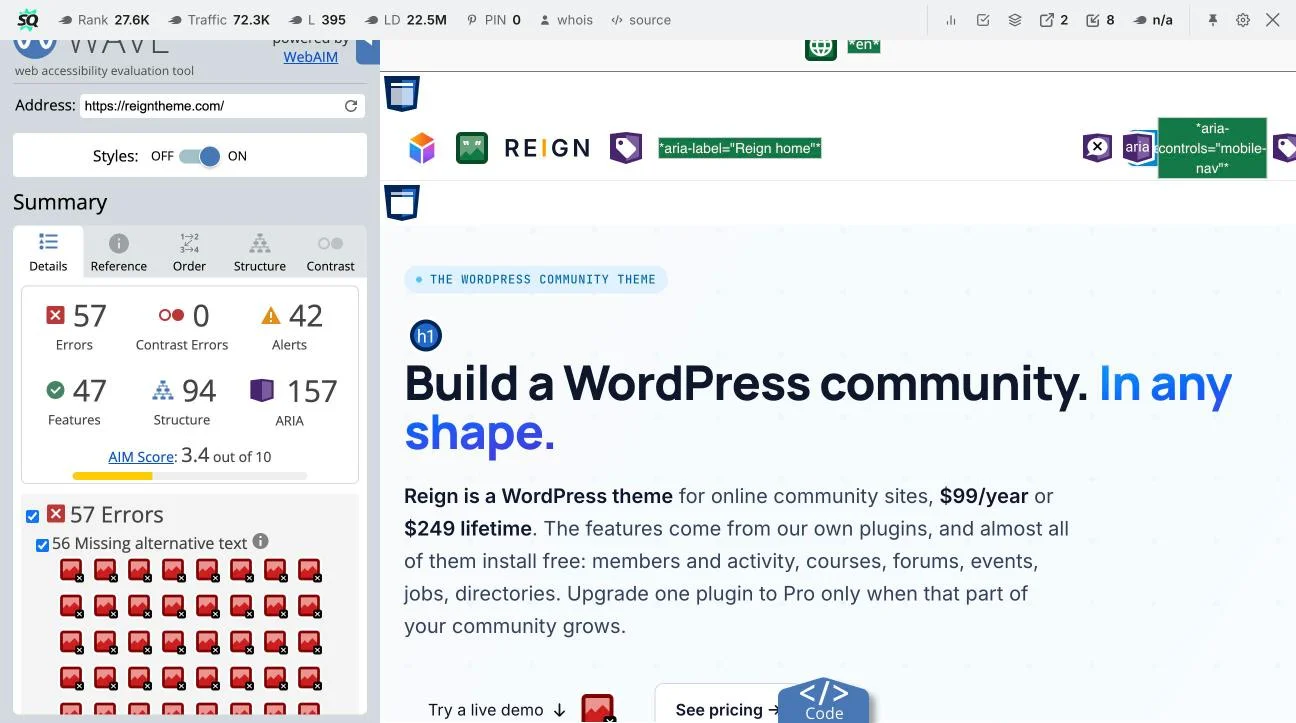
- WAVE (Web Accessibility Evaluation Tool, WebAIM). A visual overlay that marks errors, alerts, and contrast issues directly on the page, which makes it easier to explain findings to a non-technical site owner than a console-style report. The screenshot below shows a live WAVE scan, this is what the summary panel looks like: error and alert counts broken out by category, with a running “missing alternative text” tally you can click through one image at a time.
- Keyboard-only navigation test. Unplug the mouse, or just don’t touch it. Tab through the homepage, an activity feed, a member directory, and the full registration flow. Every interactive control should be reachable, every focus indicator visible, and nothing should trap you with no way out except a browser refresh.
- Screen reader spot-check. You don’t need to be fluent in NVDA or VoiceOver to catch major problems. Turn on VoiceOver (Cmd+F5 on a Mac) or install NVDA (free, Windows) and navigate the activity feed and registration form by heading and by form field. Listen for whether avatars announce names, whether buttons announce their purpose, and whether a posted update gets announced at all.
A Real-World Scenario
Priya uses NVDA and navigates primarily by keyboard. She wants to join a parenting group on a Reign-powered community site, introduce herself in the group’s activity stream, and follow two members she recognizes from a conference.
On a site that passes this checklist: she tabs to the group’s “Join” button, which announces itself clearly as “Join Parenting Circle, button.” After joining, focus moves to a confirmation message read via a role="status" live region, she doesn’t have to go hunting for it. She tabs into the post-composer field, which has a real label (“Share an update with the group”), types her introduction, and submits. The new post appearing in the stream is announced politely without interrupting her next action.
In the member list, she tabs through entries that each announce a name (“Join request accepted from Maria Chen, member since 2024”) rather than a string of unlabeled images. The “Follow” buttons next to each name are large enough to activate without precision and clearly announce their state (“Follow Maria Chen” vs. “Following Maria Chen, button”).
On a site that fails it: the “Join” button is an unlabeled icon NVDA reads as “button” with no name, the composer field is a mystery box with no label, and her posted update never announces, the only way to confirm it posted is refreshing the page and re-reading the whole feed from the top.
The member directory on that failing site is a wall of unlabeled avatar images; she can’t tell which entry is which member without asking a sighted colleague to read the screen to her. That’s the gap this checklist exists to close.
FAQs
Is WCAG 2.2 legally required for WordPress community sites?
It depends on jurisdiction and context. In the US, Title II of the ADA (as updated in 2024) requires state and local government web content to meet WCAG 2.1 AA, and many ADA lawsuits and settlements reference WCAG as the practical standard even for private businesses. The EU’s Web Accessibility Directive and the European Accessibility Act reference WCAG 2.1 AA as well, with 2.2 widely treated as the current best-practice target since it’s a strict superset of 2.1. Treat “legally required” as a question for your own counsel and jurisdiction, and treat WCAG 2.2 AA as the practical target regardless of whether a specific law names it by version number.
Do I need to fix every item on this list before launching a community site?
No single missed checkbox should block a launch, but a cluster of failures in one area, unlabeled form fields across your entire registration flow, for instance, is a real barrier, not a nitpick. Prioritize anything that blocks a task entirely (can’t complete registration, can’t post, can’t navigate past a trap) over polish items like text spacing.
What’s the difference between WCAG 2.1 and WCAG 2.2 for a site like this?
WCAG 2.2 is backward compatible with 2.1, everything in 2.1 still applies, and adds nine new success criteria, six of them at Level AA or below. The ones most relevant to a community theme are 2.4.11 Focus Not Obscured, 2.5.7 Dragging Movements, 2.5.8 Target Size (Minimum), 3.2.6 Consistent Help, 3.3.7 Redundant Entry, and 3.3.8 Accessible Authentication, all covered above, and all specifically relevant to interactive, form-heavy, dynamically-updating sites rather than static pages.
Does BuddyPress itself handle accessibility, or is it all on the theme?
BuddyPress core ships reasonable markup for a lot of its components, but theme-level CSS and customization can and does override focus styles, hide labels visually without hiding them from assistive technology correctly, and restyle buttons in ways that break target size or contrast. Running this checklist against your live, customized site, not against a bare BuddyPress install, is the only way to know what your actual members experience.
My activity feed updates automatically. Do I have to add a pause button?
If the auto-update genuinely can’t be stopped, paused, or hidden by the user, that’s a 2.2.2 concern once the moving/updating content lasts more than five seconds and is parallel to other content. Most community activity feeds qualify. A simple “New posts available, click to load” pattern instead of silent auto-insertion sidesteps the issue entirely and is usually the better UX choice anyway.
How do I test color contrast on status badges specifically?
Use axe DevTools or WAVE’s contrast checker on the badge element itself, not just the text inside it, 1.4.11 Non-text Contrast applies to the badge’s border or fill against its background, separately from 1.4.3 if there’s text layered on top. A 3:1 ratio is the minimum for the non-text graphical boundary.
Is it enough to run an automated scanner like axe or WAVE?
No. Automated tools catch an estimated 30-50% of WCAG issues reliably, missing alt text, contrast ratios, missing labels, but can’t evaluate whether alt text is accurate, whether tab order makes sense, whether a live region actually announces, or whether a keyboard trap exists. Pair automated scans with the manual keyboard and screen-reader tests above. If you’ve already covered the basics in our earlier guide on letting users change text size, this checklist is the next layer up: the structural and interaction-level checks that a text-size control alone doesn’t touch.
What about members who customize their own profile with custom CSS or bio content?
If your Reign setup allows members to add custom CSS, HTML, or embeds to their profile, that user-generated content is largely outside your direct control, but you can still require alt text on profile photo uploads, strip inline styles that create contrast failures, and make sure your profile template itself (the surrounding chrome, not the member’s content) passes every criterion above.
Does target size apply to the little reaction icons under each activity post?
Yes, 2.5.8 Target Size (Minimum) applies to any pointer target, including like/react/comment icons, unless they’re inline within a line of text, have an equivalent larger control elsewhere, or have enough spacing (a 24px circle around each one not overlapping its neighbor) to pass under the spacing exception. Measure the actual clickable area in dev tools, not just the visible icon, a small icon inside a larger invisible padding box can still pass.
Where do I start if I can only fix a few things this month?
In order of impact: fix avatar and content alt text (1.1.1, highest-frequency issue on any community site), label every form field properly (3.3.2, affects every registration and profile edit), confirm the activity feed uses a live region for new posts (4.1.3), and check keyboard operability on your modals and dropdowns (2.1.1/2.1.2, the most likely trap). Those four cover the failures that actually block someone from using the site, versus polish-level fixes.
Summary
A generic accessibility checklist will tell you to add alt text and check your color contrast, and both of those still matter. But the places a Reign community site actually loses members who use assistive technology are more specific than that: an activity feed that updates silently, a directory that’s only readable by sight, a registration wizard that forgets what you typed on the previous step, and reaction buttons too small and too close together to hit reliably.
WCAG 2.2 names all four of those failure modes directly, several of them for the first time. Run the checklist above against your live site, not a demo, not a fresh install, with axe DevTools, WAVE, a keyboard, and five minutes of a screen reader, and you’ll know exactly where your community site stands, and exactly what to fix first.