Creating a compelling landing page is both an art and a science. With just a few seconds to capture attention and drive action, your landing page must deliver the right message to the right audience at the right time. That means every element—from your headline and visuals to your CTA—must work in harmony to guide the visitor toward a single, clear objective.
The stronger the alignment between your visitor’s intent and your page’s purpose, the higher your chances of converting them into a customer or lead.
Why Landing Page Design Matters
Landing pages are different from homepages or blog posts. They have one job: to drive conversions. Whether that conversion is filling out a form, making a purchase, or downloading a resource, the goal is singular and specific. A successful landing page removes distractions, builds trust, and encourages action.
When designed with intent, a landing page can dramatically improve your return on investment (ROI). But achieving this requires more than just a pretty layout. You need strategy, structure, and psychological cues—all working together seamlessly.
Key Principles of a High-Converting Landing Page
A successful landing page balances persuasive design and psychological insight. It doesn’t just present an offer—it sells it in the most compelling way possible.
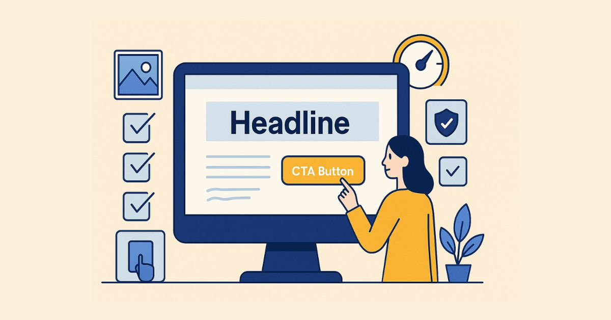
1. Start with a Clear and Compelling Headline
Your headline is the first thing people see—and it needs to tell them exactly what they’re getting. Keep it concise, benefit-driven, and aligned with the ad or link that brought them to the page. If there’s a mismatch, users will bounce.
Example: If you’re offering a free SEO checklist, a headline like “Boost Your Website Rankings with Our Free SEO Checklist” works far better than a vague “Let’s Improve Your Site!”
2. Use a Focused Call-to-Action (CTA)
Your CTA should be easy to spot and impossible to misunderstand. Use actionable language like “Download Now,” “Start Free Trial,” or “Get My Discount.” Place it above the fold and repeat it strategically as users scroll.
If you’re using WordPress, plugins like Elementor or SeedProd make it easy to create custom CTAs with buttons that convert.
3. Simplify the Layout
Good landing page design is all about clarity. Avoid clutter, reduce the number of links, and guide the user’s attention with white space and visual hierarchy. One page, one goal.
Minimalist WordPress themes like BuddyX, Astra, or Neve are excellent starting points if you’re building a clean landing page layout.
4. Highlight Key Benefits (Not Just Features)
People want to know what’s in it for them. Instead of listing technical specifications or generic features, focus on outcomes. Will they save time? Make more money? Gain peace of mind?
Use short paragraphs, bold text for key phrases, and supporting visuals. Avoid turning this into a feature list—keep it user-centric.
5. Use Visuals that Support Your Message
A compelling image or short explainer video can instantly communicate your offer. Just ensure visuals don’t overshadow your CTA or slow down the page.
On WordPress, image optimization plugins like Smush help maintain speed while using high-quality visuals.
6. Build Trust with Social Proof
Customer testimonials, user ratings, media mentions, or trust badges can dramatically boost conversion rates. These reassure visitors that others have taken the same action and found value.
If you collect testimonials, display them using a plugin like Strong Testimonials to format and style them cleanly.
7. Make Your Forms Frictionless
The more fields you include, the more likely users are to abandon the form. Ask only for what’s necessary.
Tools like WPForms offer pre-designed, mobile-friendly forms that integrate seamlessly with CRMs and email marketing tools.
Optimizing Your Landing Page on WordPress
WordPress offers unmatched flexibility when it comes to landing page design. With the right combination of tools and strategy, you can build and refine pages that convert at scale.
Choose the Right Theme and Builder
Start with a lightweight theme like Astra or GeneratePress. Combine it with a visual builder like Elementor or Beaver Builder for drag-and-drop flexibility.
These tools let you:
- Customize your page’s look without coding
- Add conversion-focused elements like countdown timers or opt-in boxes
- Preview for mobile and tablet views
Use A/B Testing Tools
Not every design decision will be perfect the first time. Use tools like Google Optimize (or Nelio A/B Testing for WordPress) to test different headlines, button colours, or form placements.
The smallest changes—like switching a red button to green—can lead to noticeable jumps in conversion rates.
Ensure Mobile Responsiveness
Most users will land on your page from a mobile device. Make sure everything—from forms to CTAs to images—displays beautifully on smaller screens. WordPress themes usually offer mobile optimization, but always double-check.
Page Speed Is Critical
A slow page kills conversions. Use tools like PageSpeed Insights or install WP Rocket to optimize loading times. Compress images, use caching, and avoid heavy scripts.
Mistakes to Avoid in Landing Page Design
Even with the best intentions, many landing pages fail due to a few common mistakes:
- Too many links: Every extra link is an invitation to leave the page.
- Overloading with information: Don’t try to answer every question upfront. Provide enough to spark interest.
- Inconsistent messaging: Make sure your page aligns with the ad or referral source.
- Generic CTAs: “Submit” is weak. “Get My Free Guide Now” is better.
- Ignoring analytics: If you don’t track performance, you can’t improve it.
Real-World Example: A WordPress Landing Page That Converts
Let’s say you’re offering a free downloadable guide on improving website speed. You create a landing page using Astra + Elementor. Your headline is: “Speed Up Your Website in 5 Easy Steps”. You add a brief, benefit-oriented subheading and a single form that asks only for name and email. Below that, you place a quick testimonial and a preview of the guide.
You track the results using Google Analytics and A/B test two versions of the CTA: “Get My Free Guide” and “Download Now.” The latter gets 12% more conversions.
That’s the kind of iterative, focused approach that leads to real success.

Design with the User in Mind
A great landing page doesn’t just happen. It’s the result of thoughtful design, smart tools, and user-first thinking. When built right—especially with the flexibility and power of WordPress—a landing page becomes one of your most valuable digital assets.
Keep testing. Keep refining. And above all, keep your user’s journey at the centre of every decision.
If you’re ready to build your next high-converting landing page, start with a great theme, add the right plugins, and apply the principles we’ve shared. The results will speak for themselves.
Interesting Reads
10 Best WordPress Plugins for Reducing Bounce Rate in 2025