
With people browsing websites from all kinds of devices — smartphones, tablets, laptops, and desktops — it’s crucial to optimize your WordPress site for different device sizes. As a website owner, if your site doesn’t look good or work well on any of these devices, you could be losing visitors and potential customers. This is where mobile optimization, responsive design, and device adaptability come into play.
Let’s explore how to make sure your website looks great and performs smoothly across all device sizes. We’ll keep it simple and walk you through the essentials, including real-life examples, some helpful code tips, and practical steps to improve your site’s responsiveness.

Why You Should Optimize WordPress Site for Different Device Sizes
Imagine this: A user opens your site on their phone and finds it hard to read, buttons are too small to click, and they have to zoom in to fill out a form. Chances are, they’ll leave within seconds. That’s why it’s essential to optimize your WordPress site for different device sizes, ensuring a smooth and user-friendly experience across smartphones, tablets, laptops, and desktops.
According to Google’s mobile-first indexing, search engines now primarily use the mobile version of a site for ranking and indexing. That means your website’s performance on mobile directly affects your SEO rankings, visibility, and user engagement.
By optimizing for multiple screen sizes, you improve:
-
User Experience (UX)
-
Mobile SEO
-
Conversion rates
-
Site speed
-
Bounce rates
What Is Responsive Web Design?
Responsive design means your website layout automatically adjusts to fit the screen size it’s being viewed on. Whether someone is using an iPhone, iPad, or desktop monitor, your site should remain functional, readable, and visually appealing.
Responsive websites use flexible grids, images, and media queries to adapt their content layout based on the user’s screen size.

CSS
.buddyx-post-section
{
display: -webkit-box;
display: flex;
-webkit-box-orient: vertical;
-webkit-box-direction: normal;
flex-direction: column;
position: relative;
}
This CSS is making sure that .buddyx-post-section:
-
Uses flexbox layout.
-
Arranges its child elements vertically (in a column).
-
Acts as a positioning context for any absolutely positioned children.
Use Mobile-First Design Approach
Designing with a mobile-first approach means you start designing the smallest screen version first and scale up for larger devices. This method ensures your core content is prioritized, lightweight, and fast on mobile devices — which usually have slower internet connections.
Here’s why it works:
-
It forces you to focus on the most important content first.
-
You eliminate clutter and unnecessary elements.
-
It’s easier to scale designs up than to squeeze large desktop layouts into small screens.
For example, instead of a full-width slider on mobile, you might show just one key image with a bold headline and a single call-to-action button.
Optimize Your Images for All Devices
Large, high-resolution images can slow down your website, especially on mobile. That’s why image optimization is crucial for device responsiveness and overall performance.

Here are simple steps to follow:
-
Compress images using tools like TinyPNG or ShortPixel.
-
Choose the right format — WebP is a great modern format for speed and quality though you may adjust according to your image.
<!– wp:image {“id”:17,”sizeSlug”:”full”,”linkDestination”:”none”} –>
<figure class=”wp-block-image size-full”>
<img src=”https://owndebt.s4-tastewp.com/wp-content/uploads/2025/05/image.jpeg” alt=”Example Image” class=”wp-image-17″ sizes=”(max-width: 600px) 400px, 800px” alt/>
</figure>
<!– /wp:image –>
Use Scalable Units Like Percentages and REMs

Avoid using fixed pixels (px) when defining widths, paddings, and font sizes. Instead, use relative units like percentages (%), EMs, or REMs to allow elements to scale fluidly with screen size.
CSS
dropdown-symbol-width: 0.7em;
content-width: 100%;
Relative units help your layout adjust automatically as the screen size changes. This is especially important when switching from landscape to portrait view on mobile devices.
Simplify Your Navigation for Small Screens
Website navigation can become a headache on mobile if not handled properly. Imagine trying to click tiny links or navigate dropdown menus on a phone — not fun.
That’s why you should use a mobile-friendly navigation system, like a hamburger menu, which expands and collapses smoothly.
<div class=”menu-toggle”>☰</div>
<nav class=”mobile-nav”>
<a href=”https://owndebt.s4-tastewp.com”>Home</a>
<a href=”https://owndebt.s4-tastewp.com/sample-page/”>Sample Page</a>
</nav>

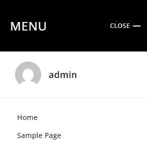
Then, use a bit of JavaScript to toggle the menu on click. It’s clean, simple, and makes navigation much easier on touchscreens.
Don’t Forget Touch-Friendly Buttons
Buttons that work on desktops might not work well on mobile. Make sure your buttons are large enough to tap with a thumb, and that there’s enough spacing between clickable elements.

According to Google’s mobile usability guidelines, buttons should be at least 48×48 pixels and have enough space around them to avoid accidental clicks.
Also, ensure buttons have a clear call to action like:
-
“Buy Now”
-
“Get Started”
-
“Learn More”
The easier it is for someone to take action, the higher your conversion rate.
Test Your Website on Real Devices
Even if everything looks perfect on your laptop, it’s vital to test your website on actual devices — smartphones, tablets, and various screen resolutions.
You can also use tools like:
-
Google Mobile-Friendly Test
-
Chrome DevTools (Device Mode)
-
BrowserStack
-
Responsinator
These tools show how your website behaves across different screen sizes, helping you identify layout issues, font readability, and broken elements.
Use a Responsive WordPress Theme
If your site is built on WordPress, using a responsive WordPress theme is the easiest way to ensure device compatibility. Many modern themes, like Reign by Wbcom Designs, are built with mobile-first design and responsiveness in mind.
Responsive themes take care of layout adjustments, font scaling, image resizing, and even navigation structure without much manual coding.
Look for themes that are:
-
SEO-optimized
-
Mobile-friendly
-
Lightweight and fast
-
Compatible with popular plugins like Elementor or WooCommerce
Keep Page Load Speed in Mind
Speed is crucial — especially on mobile. If your website takes more than 3 seconds to load, many users will bounce.
Here are tips to improve speed on all devices:
-
Use caching plugins like WP Rocket or LiteSpeed Cache
-
Minify CSS, JS, and HTML files
-
Use a Content Delivery Network (CDN)
-
Optimize images (as mentioned earlier)
-
Avoid bloated plugins or unnecessary scripts
You can test your site speed using Google PageSpeed Insights or GTmetrix.
Wrap-Up: Mobile Optimization Isn’t Optional Anymore
In short, if you want your website to succeed — whether it’s a blog, e-commerce store, or business portfolio — it must be optimized for all device sizes. From smartphones to tablets and desktops, your visitors expect fast, smooth, and user-friendly experiences.
To recap:
-
Use responsive design with flexible grids and media queries.
-
Focus on mobile-first development.
-
Optimize images and use scalable units.
-
Ensure touch-friendly navigation and buttons.
-
Test across devices and choose responsive WordPress themes.
-
Improve load speed for better performance and SEO.
When your website looks and works great on every screen, you boost engagement, increase time on site, reduce bounce rates, and improve your chances of ranking higher on Google.
Need Help Making Your Site Mobile-Ready?

If you’re looking for expert help to optimize your site for all devices, look no further than Wbcom Designs. Our team specializes in creating responsive WordPress site, mobile-friendly themes, and SEO-optimized layouts tailored to your business goals.
Let us help you create a website that works beautifully on every screen — from phones to desktops. Reach out to Wbcom Designs today and give your users the experience they deserve.
Interesting Reads
How to Leverage Local SEO Citations for Better Rankings